We're Expanding!


Hey Friends!

We continue to be busy and we’re hoping to expand our small and mighty team. Looking to hire an intermediate designer. Hoping to add someone who helps round us out and can contribute to the fun. This designer would work directly with the principal (me!) as part of a design mini-team.

I not only talk fast, but move fast so someone who is used to a fast paced working relationship, able to multi-task and likes to participate in all phases of interior design would be ideal. The hope would be that this person would grow and develop with an eye towards increased autonomy and responsibilities in both core design work and general project management.

Please send your resume to hello@bannerdaysf.com!

INTERMEDIATE DESIGNER

Responsibilities

  • Experience in the entire design process lifecycle with residential projects whether running the projects or supporting each phase

  • Manage timeline and budgets of projects in addition to the designing portion

  • Conduct site visits and working with contractors and builders

  • Mentor junior designers

  • Be comfortable taking creative ownership of the projects

  • Experience working on residential renovations and decoration projects

  • Ability to multi-task

  • Each team works on 7-9 projects concurrently ranging in decoration to full re-model

  • Strong presentation ability

Requirements

  • 3-7 years in residential design

  • Must be local to Bay Area

  • Strong Sketchup, CAD, and Adobe Creative Suite skills

  • Efficiency and experience keeping track of hours

  • Experience sourcing FF&E

  • Good team player and confident communicator

  • Experience making decisive calls

  • Leadership and someone who can show younger designers how to take initiative to keep projects moving

COMPENSATION

  • Salary commensurate with experience

  • Paid Maternity leave after a year of employment leave

  • WFH 2-3 days a week depending on meetings

  • Opportunities for upward mobility within the company

  • Good work life balance with rare and little overtime

  • 401k matching after 1 year of employment

  • 100% coverage for all health, medical, and vision insurance for employee

  • Yearly bonus and raises

  • 3 weeks PTO + 1 week between Christmas and NYE off.

  • Ability to work remotely for periods of time with the principal's approval

  • Up to 1k in professional expenses reimbursed

  • Periodic team building events such as flower arranging, a cooking class, trip to Vegas Market, visit a tile factory, etc.

Tags ,

Kitchen Blues? We Know Just the Right Color

We’re known for our signature color choices and may be guilty of having a few specific shades we can’t stop recommending. It’s no secret that blue is one of our favorite choices for the kitchen and is also preferred by our clients. Looking back through our portfolio, it’s easy to see how these blue kitchens stand the test of time, live through trends, and provide a calming place to cook and mingle. Take a tour through some recent kitchens we’ve had the pleasure of updating. 

0K1A4374-Edit.jpg
0K1A4365-Edit.jpg

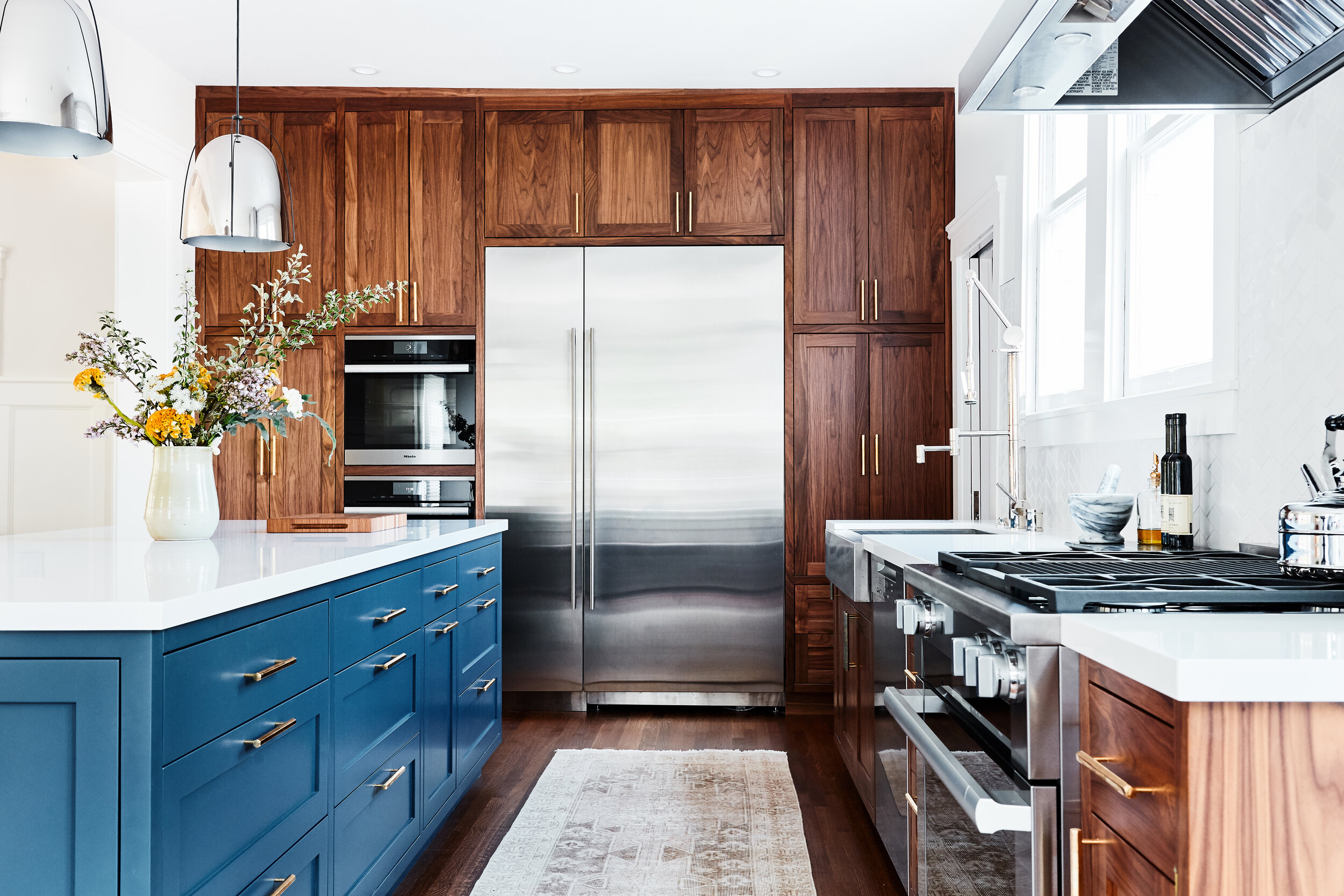
Function was at the forefront of this kitchen design. Incorporating more cool tones, this blue hinges on the cusp of slate gray, allowing the sleek appliances to take center stage. The crisp wooden window panes provide a nice warm contrast while framing out the bougainvillea in the yard, giving a pink punch. Polished nickel accents give the space a more modern touch. See more from this home here

Estates_0306.jpg
Estates_0194.jpg

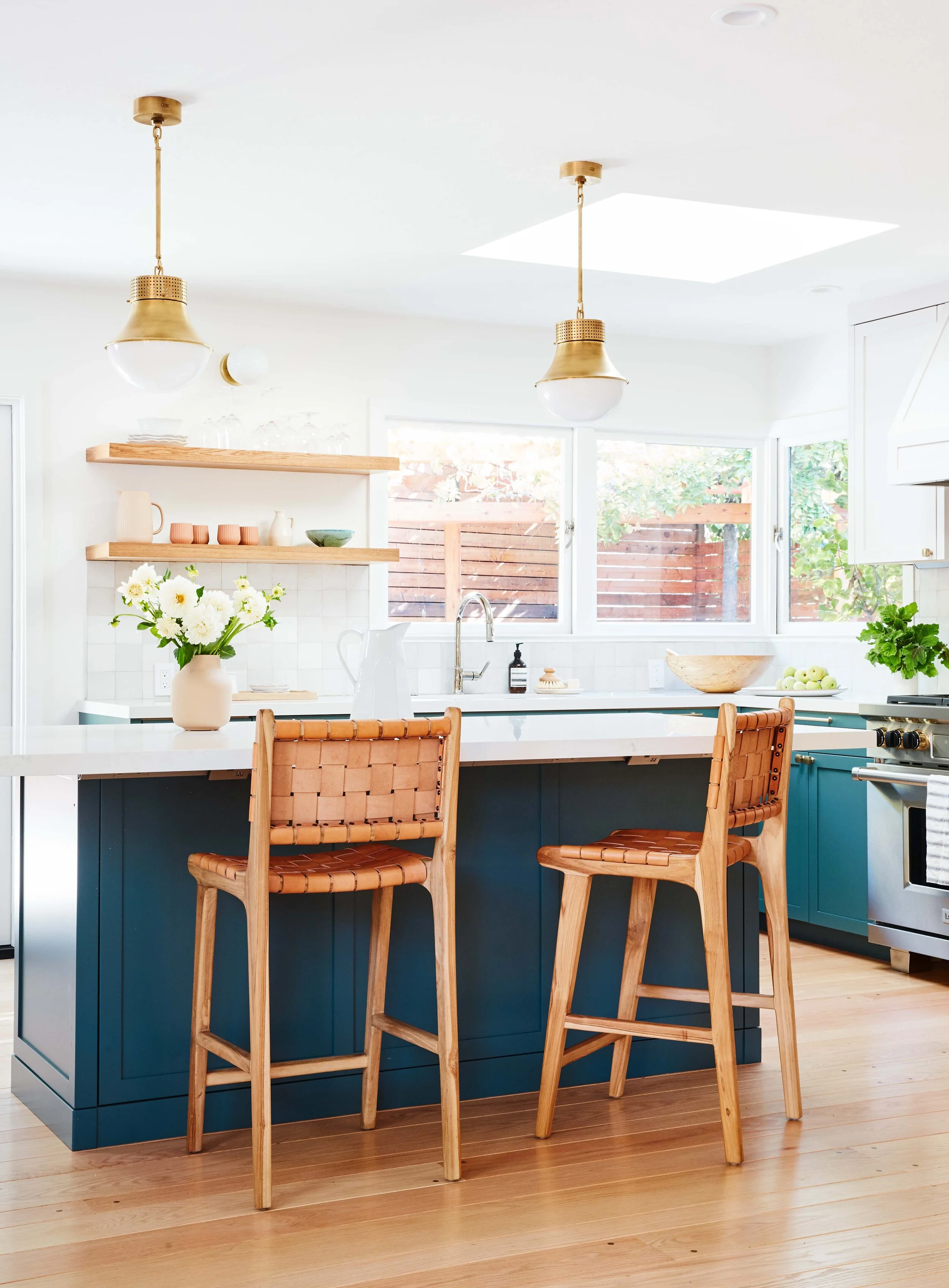
Light filled and bright, we chose just the right blue shade to play off the warm tones of the wood in the backyard. The tinge of green within the blue is enough to make it stand apart from your average blue kitchen and compliments the wood and cognac leather counter seating perfectly. A splash of brass for cabinet hardware tied in the details of the stove knobs, along with the twin pendants over the island gives this space its own personality. Featured in House Beautiful.

Uplands_14633.jpg

Not all cabinets have to be the same color. This perfectly moody cobalt lets smooth wood grain stand out, while still infusing a pop of brightness into the kitchen. With a subtle color, yet interesting tile shape for the backsplash, this space allows the accessories to sing. Explore more blue details from this Berkeley project

Want a blue kitchen of your own, but want to be sure you get that perfect shade? Reach out to us and let us know more about your project. We wouldn’t mind being repeat offenders. 

A Menlo Park Kitchen Renovation, Shades of Gray

This kitchen, although not terribly old, lacked the necessary storage and functionality for this busy family of four. The uppers were around 10” deep, meaning that you couldn’t even fit a conventional dinner plate in there! The island had storage, but no drawers so you would have to kneel down and peer into the darkness to see if you could locate whatever you were seeking. As a gap solution, the clients had built a custom open shelving system which did give them additional storage. Yet, I knew we could do better.

Sterling Kitchen Before 1.jpg

Generally, the finishes in this kitchen were ready for a makeover. The clients wanted a kitchen that was light, bright and classic. We wanted to integrate smarter storage solutions, reducing clutter by making sure everything had a home. A couple of ways we addressed this was to integrate drawers wherever possible, added closed storage to both sides of the island and installed deeper upper cabinets. We also included a larger pantry area in the adjacent laundry room which we will share with you in our next post.

IMG_4780.jpg

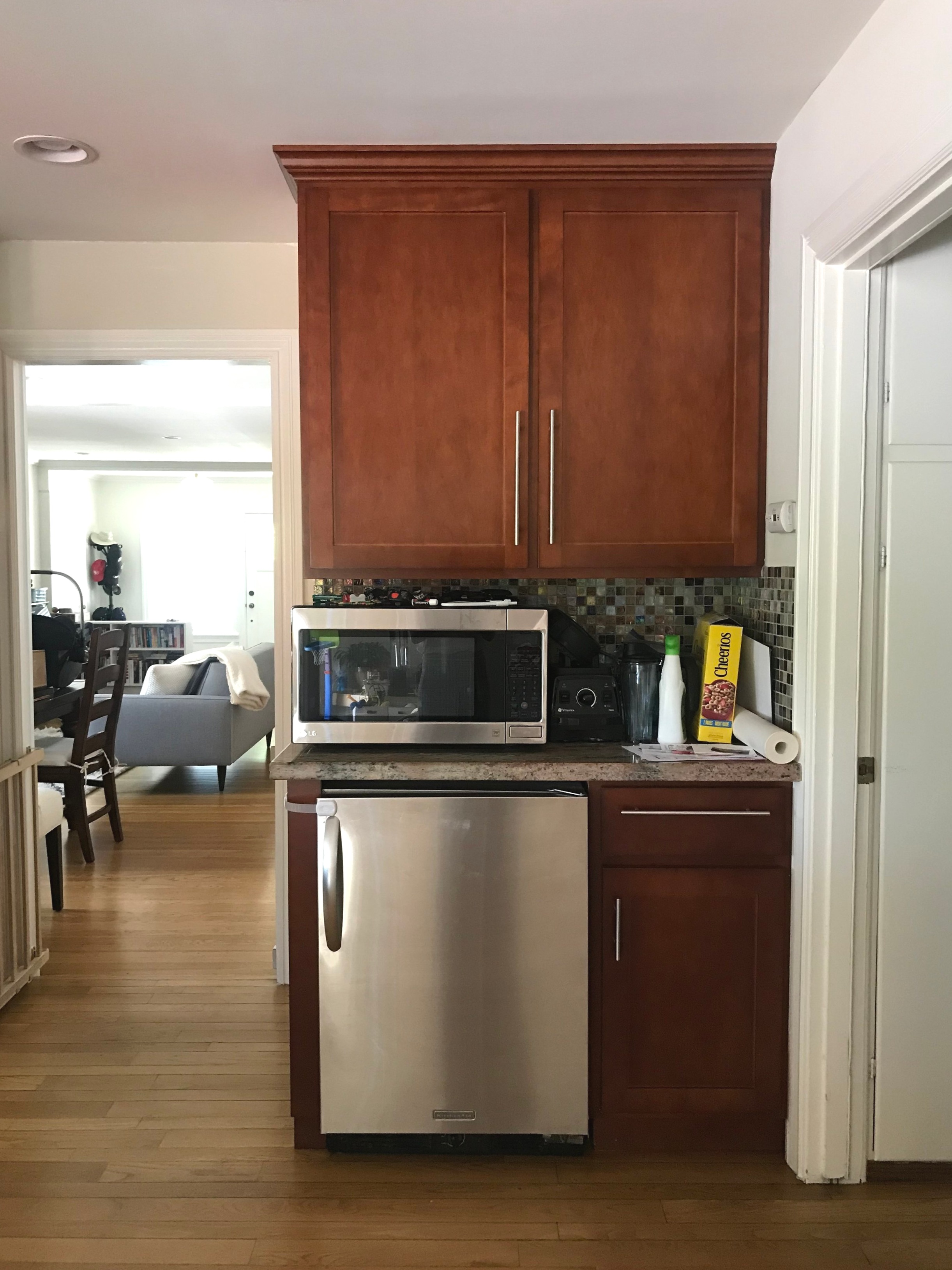
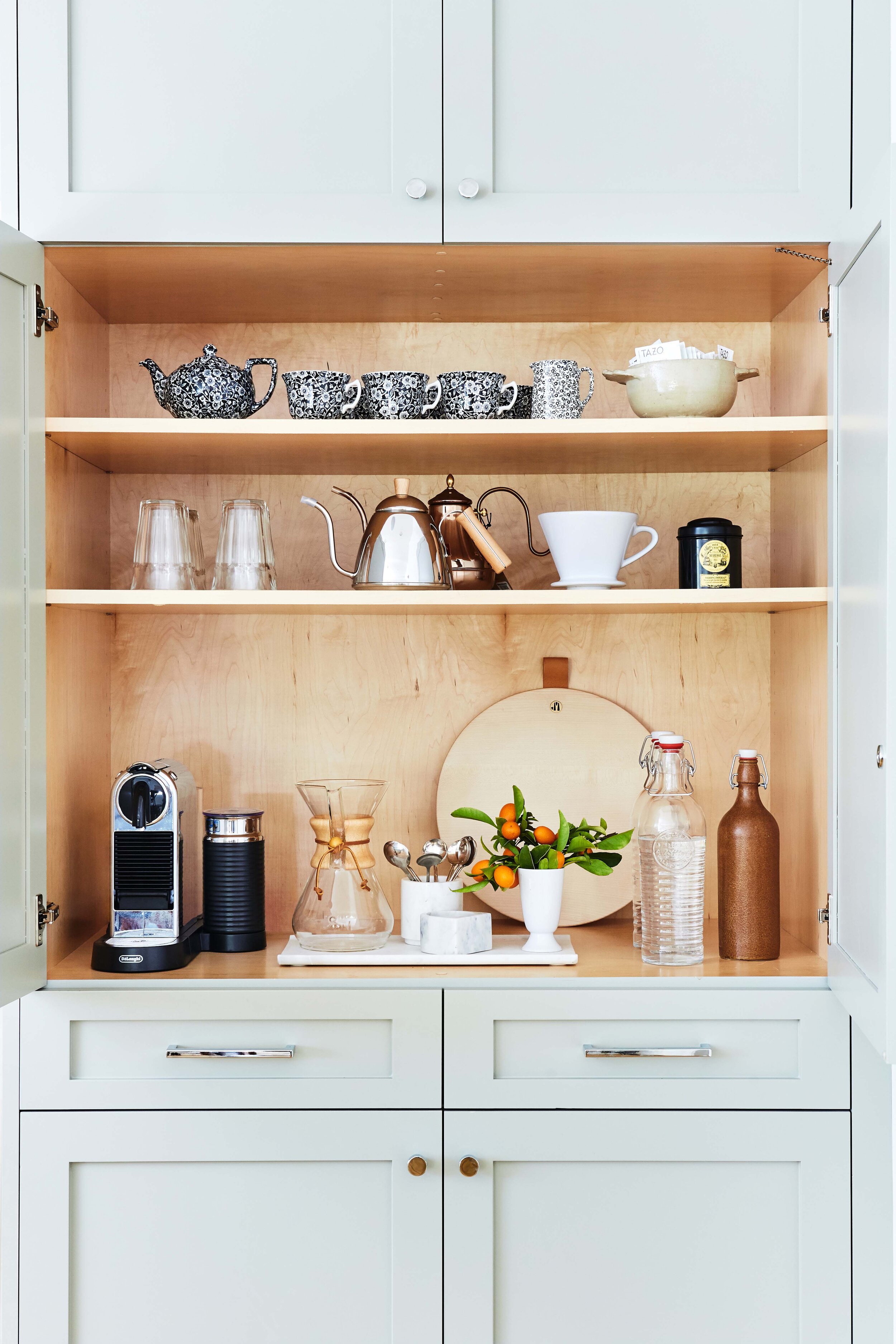
My favorite part? The coffee bar or appliance garage, whatever you want to call it. The corner shown below was underutilized in terms of use. The beverage fridge, while useful, took a significant amount of space. And the space adjacent to the microwave became a place to drop items, collecting dust. We decided to convert this into a full sized pantry.

IMG_5182.jpg

Taking input from the clients, we sourced finishes and fixtures that were traditional and classic. With two young kids, it was also important to ensure that everything we brought in and installed was durable. Below is the design board for the kitchen.

1 / 2 / 3 / 4 / 5

1 / 2 / 3 / 4 / 5

Linked above are some of the design elements we used in this kitchen renovation. We sampled a number of different grays, and landed on Fieldstone by Benjamin Moore. It has a slight green undertone which gives it a different feel from other grays. Benjamin Moore Classic Gray was used for the walls. Herringbone tile is such a classic and timeless pattern, I knew it would give longevity to the backsplash. For the countertops, we used Caesarstone countertops in a honed finish. Based on these selections, we were able to whip together a rendering to help the clients visualize the final outcome.

Sterling Kitchen.jpg

From there, we collaborated with the contractor and cabinetmaker to ensure that the design was executed correctly. There was some finessing, but overall, the final product came pretty close to the rendering above. Enjoy the after photos below!

Menlo Park Kitchen Renovation
Menlo Park Kitchen Renovation, Coffee Closet